


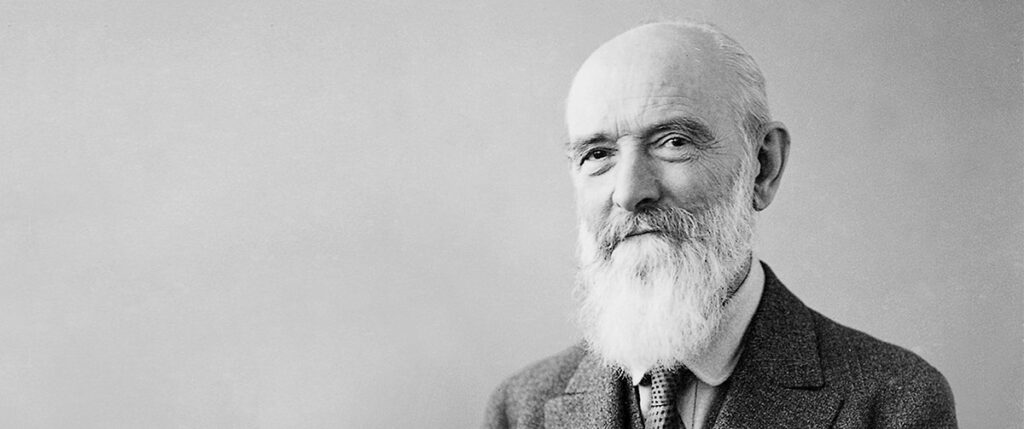
The sign off in the Bosch Logo rough work says it all! The history was made on 30Nov 18, precisely 30th November 1918, 100 years before the same day today, when Gottlob Honold invented Bosch Logo for Robert Bosch, which is inspiring generations worldwide, as there modern innovations. Gottlob’s journey with Bosch began in 1901, as the company’s first research and developer and played a big role in its growth till 1923, until his untimely demise.
Robert Bosch was the man and the visionary known for his patented innovations. A time when innovation was not everyone’s cup of tea, for him it was the driving force. At the end of innumerable ups and downs, he succeeded, only to be unstoppable for a really long time by building a brand of engineering–an empire–Bosch. Started off in 1886 as a workshop in Stuttgart, Germany, it is now the world’s topmost technocrat company with an annual revenue of more than €75 billion. Today, Bosch stands recognized and accredited with a series of products adorning its world-famous trademarked logo over everything sold.
It all began 100 years back. Logos and Trademarks were beginning to become one of the most eminent virtual ingredients in marketing. In the late 1800s, companies such as Coca-Cola, Bass Ale, and Twinings Tea had just put their foot into brand marketing through trademarked logos. That is when Bosch had to come up with one of its own too. Bosch logos always triumphed in evoking reputation, credibility, and quality.
In Germany, on November 30, 1874, the government passed an Imperial Law on Trademark Protection that was clearly based on the principle: “Traders with a company listed in the commercial register can inform the appropriate court of the marks that they place on the products themselves or on their packaging for the purpose of differentiating their products from those of other traders. The court will then enter them into the commercial register at the location of its principal place of business.” On March 3, 1899, the law led Robert to register the first trademark of Bosch–the burning magnet–for protective business deals. Magento ignition was the best-selling product of those times. Ergo, the magnet.
Bosch was an emerging company when it hit the market in the early 1900s. Robert was a staunch thinker and a talented engineer. He wanted the company to cross all the ponds and spread its wings across the globe, which it did. Back then, Bosch was generating millions of dollars’ worth of profit through its popular product magneto ignition, a major spare part used in motor cars and cycles. Bosch soon dominated the US market by doubling the sales within a year! Every magneto ignition that left Bosch’s factory had a ‘burning magnet’ stamped as a mark of originality. Around the same time, Bosch did adopt some other trademarks as well. Bosch divisions in France and the UK took up the ‘sparking armature’ for all the products.
When the wave of the First World War hit in 1914, foreign dealers fled the scene of the market. The scenario in Bosch was also not tranquil. Research and development came to a halt, male employers were called up for military services, and productions switched from magnetos to grenade detonators; a lot started happening within a few days. During the period of WWI, Bosch still used a logo–the initials RB–on all the products, as etching initials were much simpler and quicker.
Robert Bosch once wrote, “A trademark must be simple, which is why the famous, good trademarks, the best of the crop, are plain line drawings(…) Trademarks must be simple and clear if they are going to make an impression and be easily remembered.”
The mystique around Bosch’s logos was loud and clear–Bosch products and their integrity. After WWI ceased in 1918, Bosch trademarked and registered a new logo–an armature in a circle–which has been in use since then. The armature symbol was designed by the then-chief innovator Gottlob Honold. He sketched Bosch’s most known product of all times, the magneto ignition system, which was one of his inventions too. The same logo stays linked to the brand this very day, after a century, giving a bold statement on its existence.
As far as the developments are concerned, in 2004, Erik Spiekermann of United Designers Network changed the colour of the logo; while Christian Schwart developed new set of fonts for the logo viz. Bosch Sans and Bosch Serif typefaces. The logo has a magneto armature encased within a silver grey circle. In addition, on the right side of the symbol, there is the company’s’ name in bold red caps, followed by the company’s ever-promising tagline, Invented For Life, written beneath black. The three colours of the logo, silver grey, red, and black, symbolises excellence, reliability, and creativity–something that Bosch swears by.
The Bosch logo, even after a 100-year mark, continues to attract the minds of the people enabling them to directly connect with the brand, a brand known for dedicating all their inventions for life—for humanity!